Quizlet Intern Hackweek · 2022
Let’s Get Engaged
A home-screen widget that starts the session, instead of scoring it.
- Role
- Product & visual design
- Timeline
- Five days · Aug 2022 · shipped
- Team
- 1 design · 2 eng · 1 data
- Platform
- iOS 16 · Android 12
- Status
- Live
What made this worth doing?
Quizlet’s Intern Hackweek is five days in August; small teams build something and employees vote at the end. In 2022 my team of four made a home-screen study widget for iOS and Android. It won two of the employee votes — “Ship It Now” and “Crowd Favorite” — and went into a ship pipeline. I left at the end of the summer; it shipped after that, which is the part I had no hand in.
The reason was where the User Growth team was stuck. Their read, after a long stretch on streaks, badges and achievements, was that a streak only works if the goal feels reachable and stays in view. Quizlet’s streak was reachable: consecutive days with at least one flashcard studied. It was not in view. The only place to see it was the profile tab, three taps into the app, which is to say nowhere. My question was smaller than theirs: what is the most-present surface a student already has? The home screen.
What was actually broken?
Two things. The first was visibility. The growth team’s data, as I had it that week, said that for two in three users the longest streak ever was one day, and that where streaks did stick they were worth on the order of twelve million extra study sessions a year. A thing that powerful in a place that hidden is the plain definition of broken.
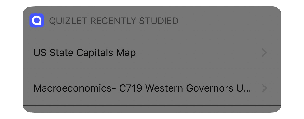
The second was that Quizlet already had a widget. It was a grey system-default list called “Quizlet Recently Studied”: two set titles, two chevrons. No streak, no state, nothing that changed between morning and night, so nothing that earned a glance. It proved two things: the feed of recently studied sets already existed in the app, so a widget that led with sets was cheap; and a widget that only lists things gets ignored, so a streak number beside the list would not be enough. The break was not “no widget.” It was that nothing on the home screen gave a student a reason to look and a reason to tap in the same glance.
Five days, two platforms, one designer
A team of four: me on design, two engineers, one data scientist. The widget had to run on iOS 16 with WidgetKit and on Android 12 under Material Design 3, two systems that disagree about sizes, corners and type. The data we could show was whatever the app already exposed: the streak count, the recently studied sets, and the Still learning / Mastered counts that sit behind Quizlet Plus. No time for new research, so I built on the growth team’s, plus a journey map and a competitive audit of my own that I describe rather than show.
The widget is a door, not a trophy case
I started where the growth team’s language pointed: a flame and a number. I didn’t believe it for long. A number you saw this morning does nothing at the next unlock and says nothing about what to do next. The journey map said the same thing: students were mostly fine until the long haul, where it reads “goes out of way to see streak data on profile page” and then “forgets about streak.” The streak had stopped being part of the moment a session starts.
The streak gets the glance. The set gets the tap.
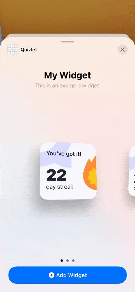
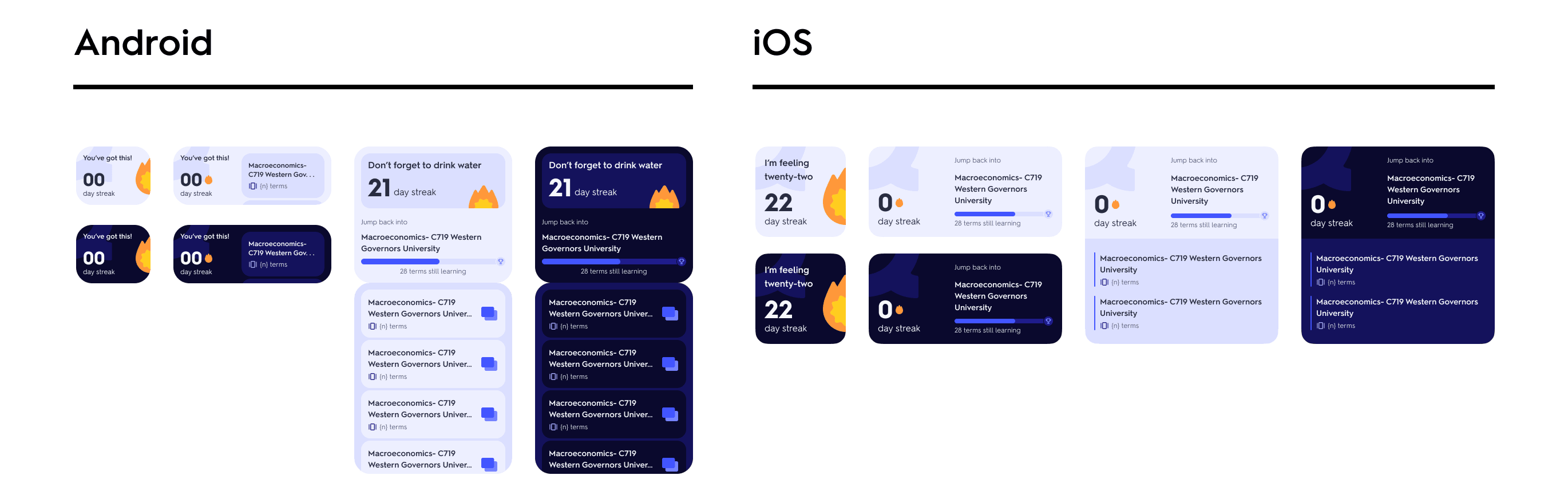
The claim I carried through the week: the widget is where a study session starts, not where it gets scored. The streak earns the glance, because it changes day to day. A recently studied set, one tap from the cards, earns the tap. In the iOS widget gallery the finished family reads that way: small is the flame and the count; medium and large put “Jump back into” and a set beside it.
What I chose, and what I killed
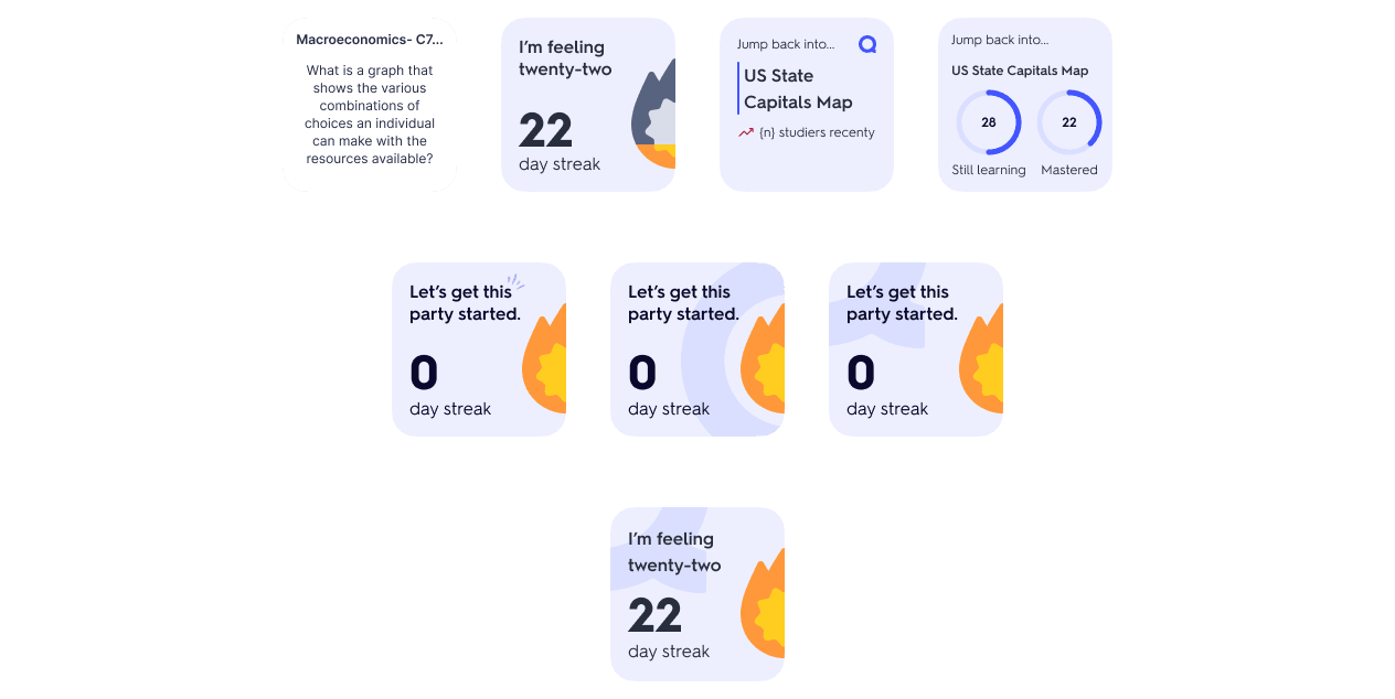
Starting at the smallest size, with the HIG and Material 3 as guardrails and the team’s critique as the filter, I drew about a dozen directions in the first day. The work after that was subtraction; three cuts are worth naming.
The flashcard itself went first. One early frame put an actual question on the widget — a macroeconomics prompt in a small rounded square — and it read as a wall of tiny text. At widget scale a card is not a card, it is a paragraph, and a paragraph on a home screen is something you learn not to see. The set title took its place: a promise of the cards rather than an attempt to be them.
“Recent studiers” went second. I wanted a line of social proof under the set, because it is what keeps a public set feeling alive. The engineers were clear that the native app did not expose that count yet, and a hackweek widget that needs a new backend field is not a hackweek widget. It is a note in the file, not a line on the screen.
The third cut cost me something. The “Still learning / Mastered” rings were my favourite frame of the week: two progress circles beside the set, the most honest picture of where you are in it. But those counts sit behind Quizlet Plus, and the read in the room was that most people who added the widget would never see them filled: my favourite frame would be an empty state. A widget that is blank for most people is worse than one with less on it. The rings went; a single “terms still learning” bar survived into the medium and large frames.
What I chose was a small streak square for the glance, a medium and large “Jump back into” layout for the tap, light and dark variants of each, and a separate Android family rather than a port: Material’s widget guidelines gave the small size a wider, shorter footprint and its own corner and type treatment, and iOS geometry forced onto it would have looked wrong to every Android user.

What actually shipped
A finished design for both platforms, and then a real release: the widget went out to students. It won two internal votes first, “Ship It Now” and “Crowd Favorite” — employee votes at the end of a five-day hackathon, not a launch decision — and the Ship It Now vote moved it into a ship pipeline. One piece of feedback said it “looks ready to be used by our users”. My summer ended before the release did, so the build that reached the store was finished by the team, not by me.
The success criteria we set at the start were the growth team’s numbers: time in app, time studying, and one-, seven-, and twenty-eight-day retention. I wasn’t there to measure them. The one number I’d still instrument is narrower: the share of widget taps that became a study session within a minute. Everything the design argues for lives in that ratio.
What I know now
I would start at the medium size, not the small one. I spent the first day where the platform guidelines pointed, the smallest widget, and a small square can only ever hold the number — exactly the trophy I ended up arguing against. The medium size is where the set title fits and where the real decision lived. Had I started there, the rings and the flashcard would have died sooner, with the set at the centre from the first frame.
The belief I would defend: a hackweek project’s job is to win an argument, not to ship. Ours won the room, which is what the two votes were, and the shipping part depended on teams and quarters I didn’t control. The screens took five days. The argument is still true.