Side project · 2026
Phloe
Practice that makes you answer, instead of re-read.
- Role
- Co-founder — design, front of the app, some Swift
- Timeline
- 2026 →
- Team
- Two
- Platform
- iOS
- Status
- Live
What made this worth doing?
Phloe is live on the App Store. It is a side project, not a job: I co-founded it, I design it, and I am in the Swift when an animation is wrong. There are no usage numbers on this page because we have not published any.
Intro biology, AP or first-year college, is months of content examined a few times. The student I keep in mind is not failing. She is re-reading. The night before a unit test she opens the chapter, highlights, feels the material turn familiar, and walks in feeling ready. Familiarity is a real feeling and it is the wrong one. The exam does not ask whether a paragraph looks familiar; it asks her to explain why a claim about cells is wrong. Re-reading feels like progress because it is easy, which is exactly why it does not predict the score.
A summer at Quizlet showed me how much study time goes into flipping cards and nodding. I wanted the small, opinionated version of a study app: one that only counts answers given before the reveal, follows the class she is actually in, and is honest about what is and is not known yet.
What was actually broken?
The break is a mechanism, not a category. Every common study tool puts the answer in view before the student has committed to one. The textbook has the answer on the same page. The review sheet is the answer. A flashcard flips in under a second, and the moment the back is visible the brain does the cheap thing: it recognizes, nods, and files the card as known. Familiarity masquerades as knowledge, and the student cannot feel the difference from the inside.
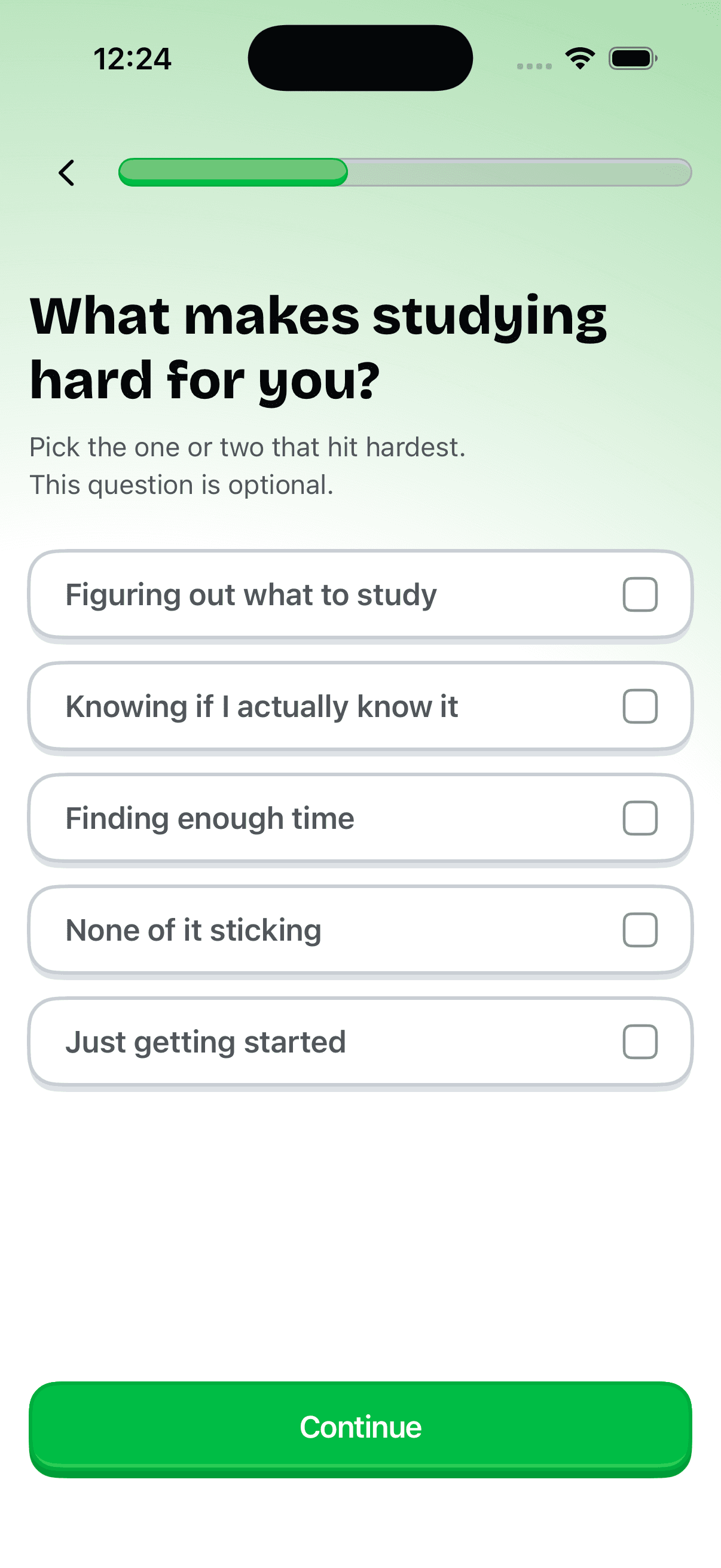
The second break sits one level up, in the score. A quiz that reports eighty percent has blended two different things: answers the student knew and answers she got by elimination, or by luck. A right answer from knowledge and a right answer from a guess look identical on the results screen, so she leaves a study session with a number that is partly fiction. One of the options I wrote for the onboarding question about what makes studying hard is “Knowing if I actually know it,” and it sits there because that is the sentence I kept hearing. That is the failure Phloe is built against: not a lack of content, but a lack of honest feedback about which parts of the content are actually held.
Two of us and four thousand questions
The shape of the product comes from three walls. The first is people: two of us, one of whom writes the backend, so every screen I draw is a screen one of us has to build in SwiftUI and keep consistent with Supabase. The second is the App Store review cycle: a fix is live when Apple says so, not when it is merged, so screens ship in batches and a wrong screen stays wrong for days. The third is the bank. Our question bank holds 4,309 questions, served through a curriculum built from each student’s class or syllabus, and a bank that size will have wrong questions in it. Few screens, one mascot, and a defect queue behind the questions: that is what those walls produce.
Right or wrong is only half the signal
I started out thinking the product was the spacing engine; the first version of our database was built around one. What I did not know before starting is that whether an answer is right is only half the signal. Lay a student’s answers on two axes, right or wrong and sure or unsure, and three of the four quadrants are fine. Wrong and unsure is learning. Right and sure is knowledge. Right and unsure is a guess that got lucky, and a second pass usually catches it. The fourth quadrant is the only one that costs points on the exam and the only one the student cannot see by herself: confident and wrong.
Confident and wrong.
That quadrant is invisible unless you ask for the confidence before the reveal. Asked after, the answer is contaminated by hindsight; everyone was sure once they can see the answer. So the design thesis became: capture predicted confidence first, show the answer second, and treat an overconfident miss as the most important event in the app. The onboarding option below is the same idea in the student’s words.
What I chose, and what I killed
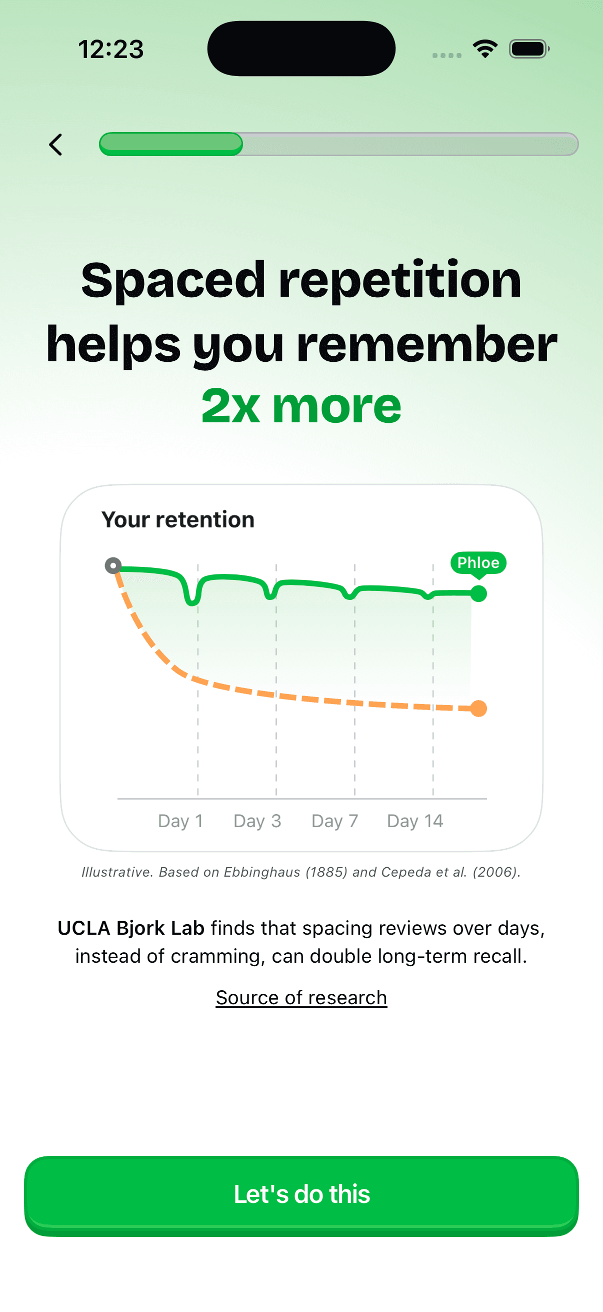
Missions along the syllabus, not a spacing engine. The first architecture was a spaced-repetition system over atomized content; the migration that replaced it says so in its first line. What shipped instead is one mission per unit of her actual class, built from her syllabus, unlocked in order, with a Today tab that says what is next and what she missed yesterday. The onboarding still promises spacing; the honest version of that promise today is the sequence, not an interval algorithm. What the missions buy is a plan that can say which unit is next and how many days are left before the exam, which is her actual question.
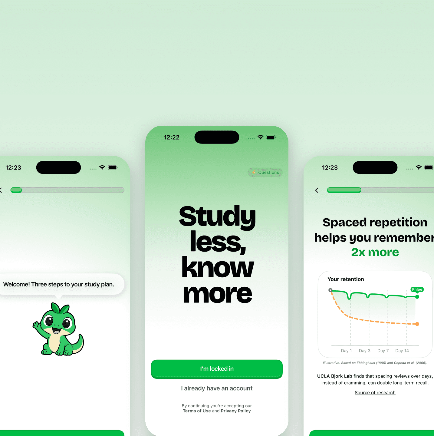
A warm-up instead of a loading screen. The welcome bubble says “Three steps to your study plan”: which classes, why spacing works, what makes studying hard. After them the flow asks for a school and a syllabus, both skippable, and then the curriculum has to be built. The version we killed showed a build-wait screen. Instead the build runs in the background while she answers five hand-written questions, four easy and one medium, framed as a warm-up rather than a test. Her answers are logged so the unit shows complete; they do not place her. The reason is the thesis: her first minute should be a commitment before a reveal, not a spinner. The paywall comes after all of that, after the account, when she has a plan and five answers on record, not before the first question.
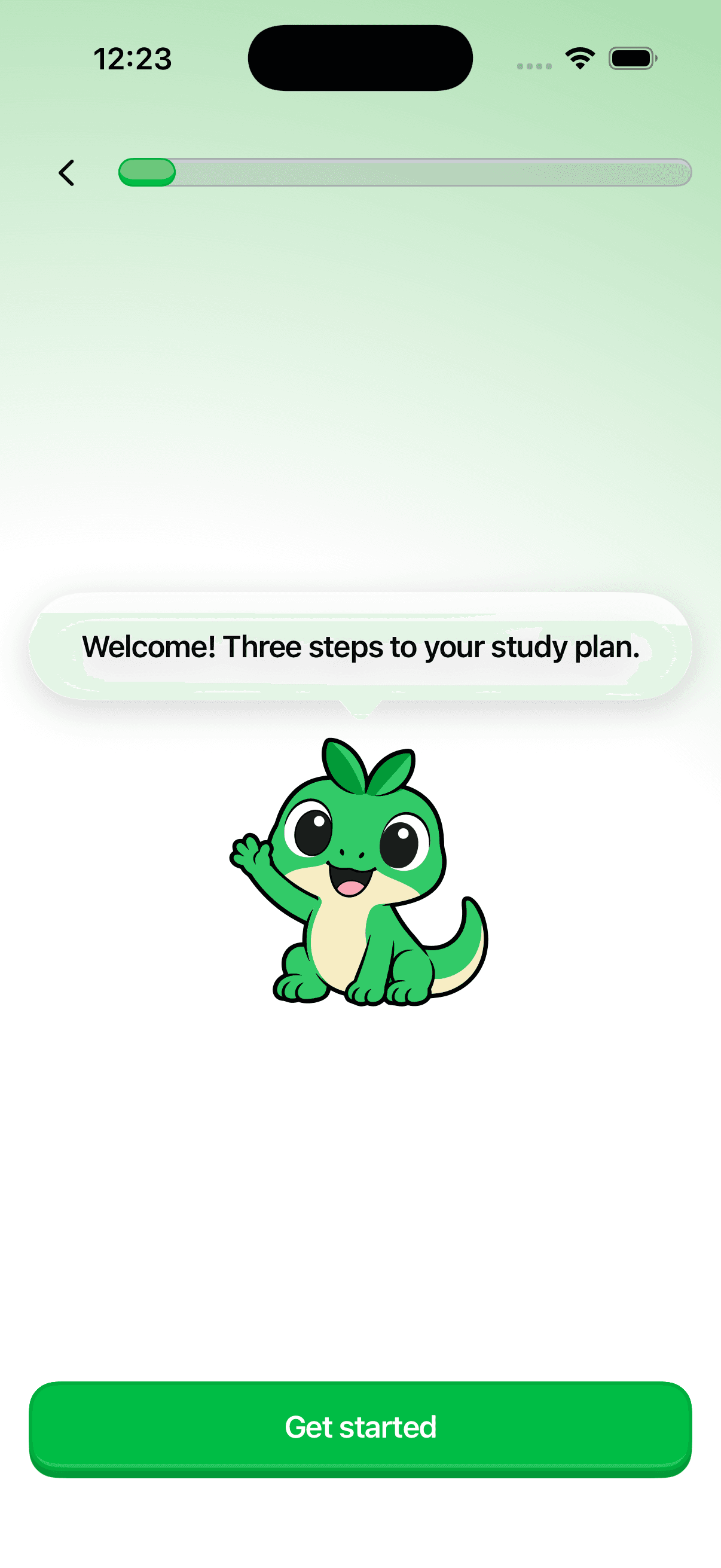
The mascot has four states, not forty: waving, sitting, thinking, excited, plus a costume for the paywall. It went through many drafts, and then the set stopped growing. The alternative is the Duolingo-scale cast; the reason it is four is not taste but that one designer owns every state and one of us writes every transition. Being in the Swift changed this: once I was keeping the mascot consistent across the welcome, the warm-up, the account screen, and the paywall, each new expression became a view state to maintain, not a drawing, so the set stayed small.

A chart that cites its sources instead of pretending to be yours. The retention screen makes a claim, “2x more,” and I wanted it to be clean. What shipped is a curve labeled “Illustrative. Based on Ebbinghaus (1885) and Cepeda et al. (2006),” with the “double” credited to UCLA’s Bjork Lab and linked to the research. I rejected the unlabeled version because a student who later sees her own retention will compare it to this picture, and the picture should never have claimed to be her. The caption is the least glamorous line on the screen and the one I would defend hardest.
The one that cost me something. I wanted the confidence tap on every question in the first release. The database column exists; the client does not write it yet. We shipped the missions and the bank first, and I built Assay, a small internal console for triaging question defects, because 4,309 questions will have wrong ones and a group chat is not a queue. That was the right order and I still resent it, because the app launched without the one number I most want to see.
What actually shipped
An iOS app on the App Store, built in SwiftUI on Supabase: 4,309 curriculum-mapped questions, missions built from the student’s class or syllabus and unlocked in order, a Today tab with what is next and what she missed yesterday, an exam countdown, study-window reminders, a five-question warm-up, a four-state mascot, and a paywall through RevenueCat. A student can download it today, pick her class, and be answering questions inside a few minutes.
The bar I would hold the launch to is modest: students come back on their own for a second session. We do not publish numbers and I will not put any here. But we shipped before we instrumented the signal the product is premised on, and the one number I would watch is the share of students who come back the day after a wrong answer. Not streaks, not sessions. A student who returns after being told she was wrong is a student who trusts the app to be right about her. The first thing to add is the confidence tap before the reveal; the second is that day-after-wrong return rate, split by whether the miss was confident.
What I know now
The thing I would do differently is order. I would ship the confidence capture before the retention-chart screen, and accept a plainer onboarding to pay for it, because the chart explains the method and the capture is the method. The time we spent polishing the first minute bought a nicer first minute; the same time on the capture would have bought the signal the whole product is premised on.
The belief I would defend in an interview is that content volume is not the wedge. Anyone can assemble four thousand questions now. The wedge is calibration: knowing, per student, where she is confident and wrong, and putting that quadrant first. And a smaller one: a number with an owner beats a clean number without one, even when the clean number is true.