Quizlet · 2022
Student on Board
Onboarding for a flashcard that never said it flipped.
- Role
- Product design intern
- Timeline
- Summer 2022 · ~5 of 10 weeks
- Team
- PM · EM · 2 design · 3 eng
- Platform
- Web
- Status
- Partially shipped
What made this worth doing?
In summer 2022 I was a product design intern on Quizlet’s Set Page team, and the onboarding for a new card was the piece I owned. Half of it shipped: the onboarding text, on the logged-out web set page. The other half, an animation I liked much more, did not.
The set page is the page a study set lives on, the one a search for a term lands you on. My mentor Mike Castro describes it as one of Quizlet’s most trafficked pages. Heading into back-to-school, the team was replacing the card at the top of that page, Study Preview, with a new one called Mini Flashcards. Study Preview had earned its place: the prior research the team pointed me to credited it with a retention lift of four to nine percent. The first thing a new learner does on that page is the first thing they do on Quizlet. If that moment went silent, it would go silent for a lot of people at once.
What was actually broken?
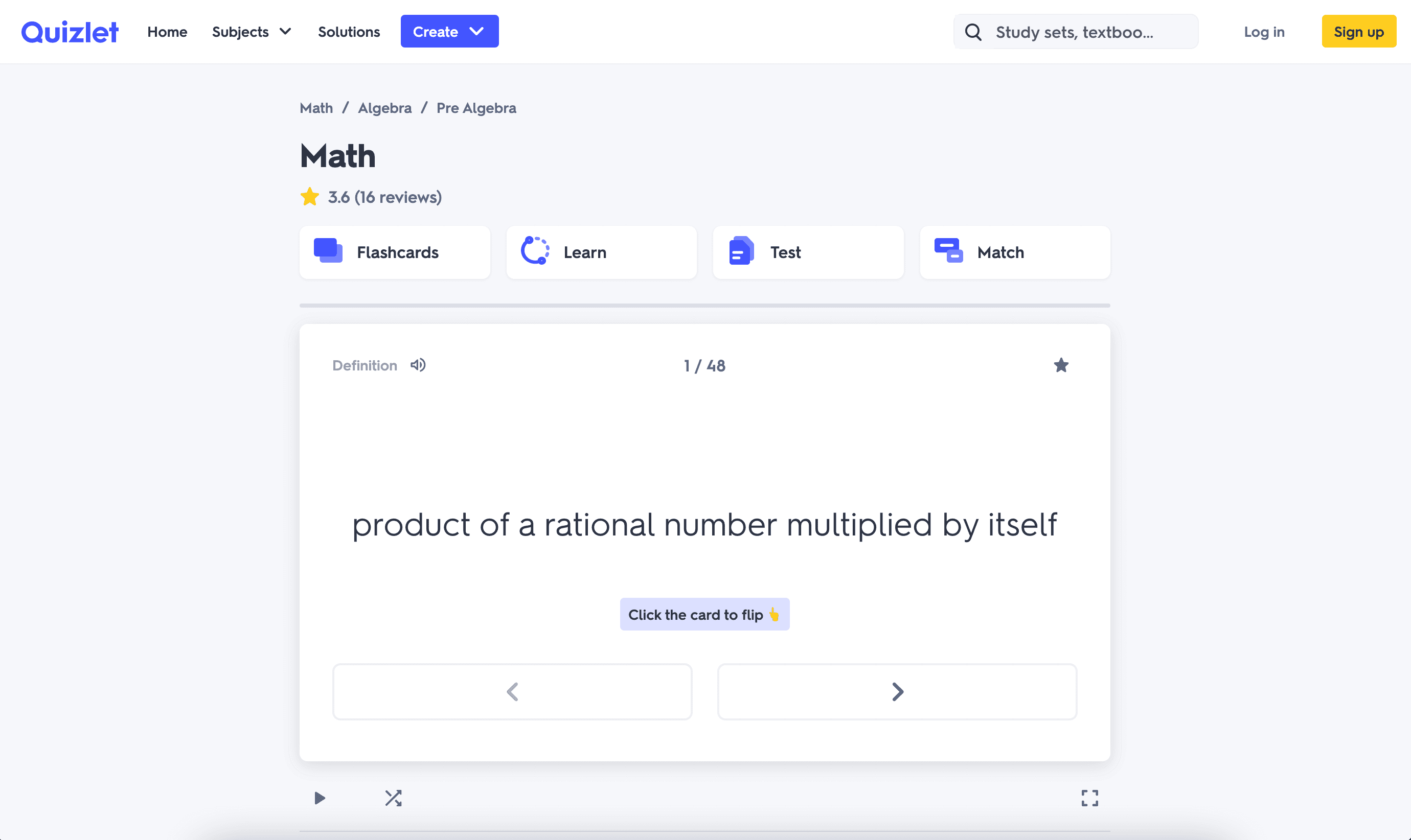
A flashcard is a question with an answer behind it, and the whole interaction rests on the learner knowing the answer is there. Study Preview told you: a dark footer across the bottom read “Click card to see definition.” Mini Flashcards arrived without that footer. What it had instead were two wide arrow buttons under the term, and arrows do the one thing that is not flipping: they advance to the next card. So a first-time learner landing from search saw a white card with a term on it, a counter reading 1 / 32, and two buttons that would walk them through all thirty-two terms without ever showing a definition.
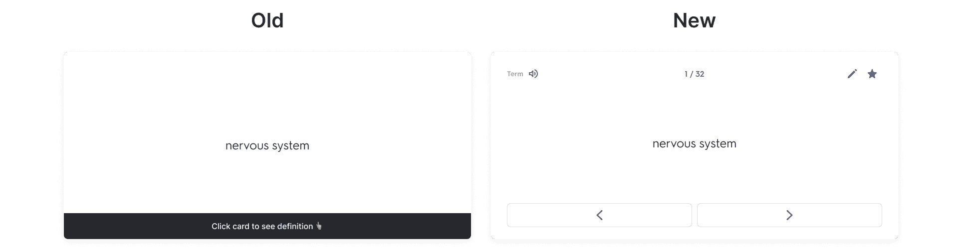
So the brief I actually worked from was not “design an onboarding” but get a person who has never seen this card to flip it once, and then a second time. The alpha data, when it came back, pointed the same way: the team’s read was that Mini Flashcards performed well on nearly everything except flips, which had dropped against Study Preview. Nobody could prove the missing text was the cause, but it was the most obvious thing that had changed.
Five weeks and a page nobody gets to break
I had about five weeks of a ten-week internship for this, and the three engineers on the team were already spending theirs on the Mini Flashcards launch itself. Anything I designed had to ride on that launch or wait behind it. On a page with that much traffic, the team’s rule was that nothing ships without a clean way to measure it, so every idea had to come with its test. And from the start the mandate included a backup in case the alpha came back shaky. That shaped the work into two tracks, one ambitious and one boring, long before I knew which one would matter.
They reached for the arrows
I started where the brief pointed: show the interaction through motion instead of copy. I sketched with Mike in a jam session, watched people handle paper flashcards, and broke the old logged-out moment into the three things it did: one flip, a nudge, one line of text. Then I ran the user interviews. I put students in front of the new card and watched what their hands did.
They reached for the arrows.
They didn’t tap the card. They went for the arrows, because the arrows were the only thing on the card that looked like a control, and the arrow advanced instead of flipping. I had been designing a cue for the card. The students were telling me the cue belonged wherever their hand already was. That moved the onboarding text out of the card’s body and down toward the arrows, and meant rebuilding the white space under the term to hold a line of copy without breaking the card’s hierarchy.
What I chose, and what I killed
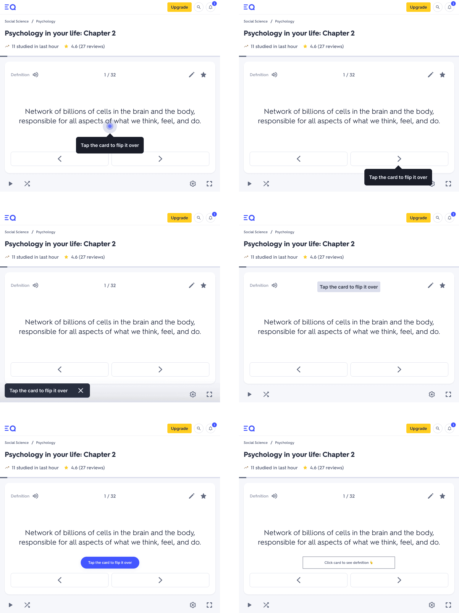
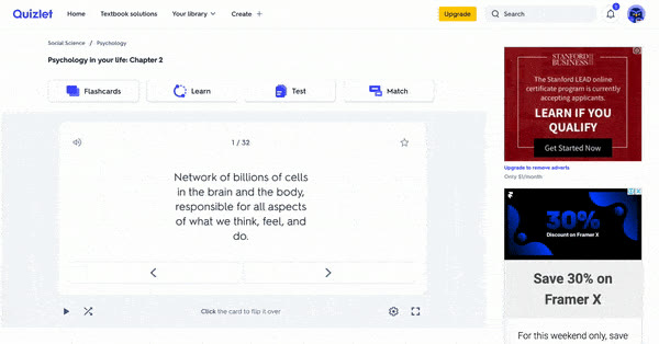
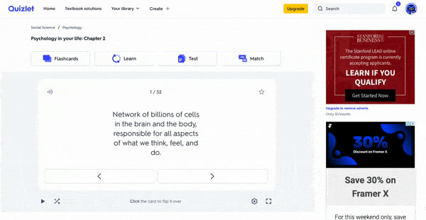
Flip First over Shuffle and Tilt. I took three interaction concepts to critique. Shuffle dealt the cards into view, which was lively. Tilt leaned the card under the pointer, and was the one I prototyped in code rather than in Figma, which is how I found out what it actually felt like under a cursor. Flip First peeked at the back of the card and then flipped it. Critique picked Flip First, for the reason I would have given: the peek showed both sides of the card and hinted that more cards waited behind it, which is exactly the nudge to flip. The other two moved the card; neither one demonstrated the gesture we wanted.
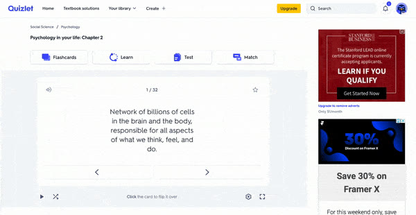
Text at the arrows, not in the card. I tried six placements of one instruction, “Tap the card to flip it over” in five of them and the old footer’s wording in the sixth: a tooltip on the card, a tooltip on the arrow, a toast in the corner, a chip above the term, a solid button, and a plain outlined label. The tooltips and the toast sat on top of things; the button invited a press the card didn’t need. A quiet chip between the term and the arrows won, because it sat on the path the students’ hands were already taking. By the time it shipped the wording had shortened to “Click the card to flip.” A second, dismissible chip nudged the next move, and a current-terms list under the card tied the single card back to the set.
Killing Flip First. This is the one that cost me something. The peek-and-flip was the work I was proudest of that summer, and I had a composed prototype of it running. Before back-to-school the team descoped it. The alpha had come back strong without it, the engineers’ time was the launch, and on the most trafficked page the team shipped what was de-risked and measurable before the deadline. A line of text was both. An animation was neither. So the text went and the animation stayed in Figma. I let it go, because the argument against it was the rule I had been designing under all along.
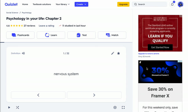
What actually shipped
What exists in the world is a small line of text under the card on the logged-out set page, “Click the card to flip” with a pointing hand, sitting between the term and the arrows. The animation did not ship. The text went out as an A/B test the team designed, with three metrics: median questions viewed, median flipped, and total time studying. The question the test was built to answer was whether flips came back without the other two moving the wrong way.
I don’t have a result I can quote, so I won’t quote one. The one number I would watch is first-flip rate: of the people who land on a set page cold, how many flip the first card, and how long it takes them. If I were instrumenting it today I would log the time from page load to first flip, split by whether the learner came in from search. Everything else the onboarding was for follows from that.
What I know now
I would run the boring track first. In week two I could have put the six text placements in front of students and shipped the winner, and spent the remaining weeks on Flip First only if the copy didn’t earn the flips on its own. Instead I followed the brief toward the animation first, and the text was what was left standing when the deadline arrived. Same outcome, known weeks sooner.
The belief I would defend: on a page this trafficked, the quiet half of an onboarding is the half that matters, and you cannot tell that at the time. A label that names the interaction does most of the work; a motion on top of it is a luxury you earn after the label has been measured. Ship the measurable half first and let the flashy half prove it deserves the engineers.